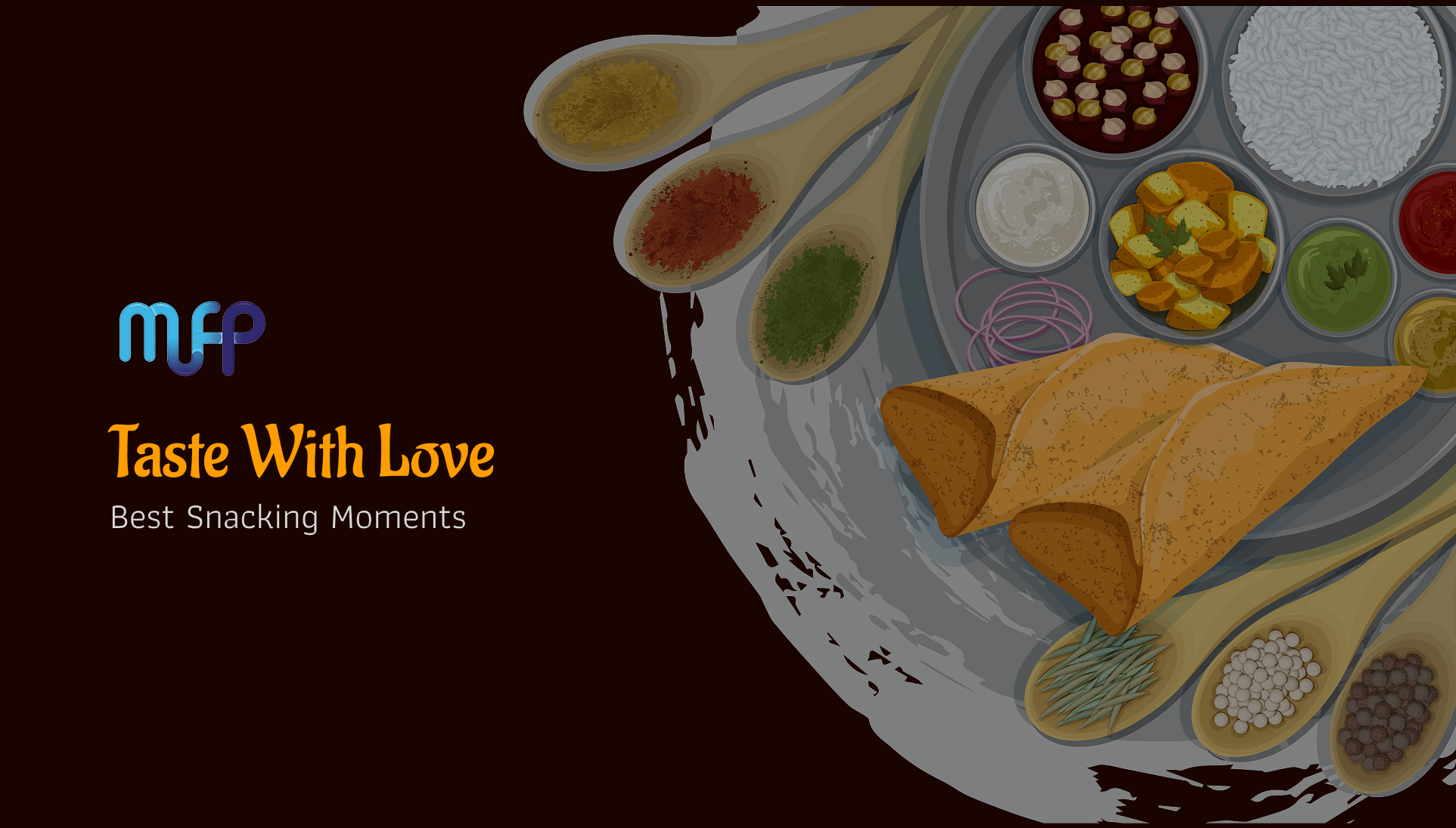
Overview
McSharp, a traditional and modern snacks brand, wanted to create a new website to showcase its wide range of products — from traditional banana chips to instant curry mixes. The objective was to build a digital presence that reflects the brand’s identity, excites users, and makes product discovery seamless.
Problem Statement
Before the new website, McSharp had no strong digital presence. Customers learned about the products mostly offline, and there was no central platform to:
-
Explore the variety of products.
-
Understand the brand’s story and traditional values.
-
Enquire or get in touch with the company easily.
-
Timeline
:
3 Weeks
-
Role :
UX UI Designer
-
Tools :
Figma, Photoshop, Notion, Vscode
The Challenge
Design and launch a new website from scratch that feels modern, intuitive, and trustworthy.
The Research
I started with stakeholder interviews and competitive benchmarking of other food/snacks brands. Key findings:
-
Customers want quick access to products without reading long text.
-
A snack brand’s website should appeal visually — strong food photography, simple descriptions, and clear categories.
-
Mobile-first experience is critical since most users browse food/snack brands on phones.
The Goals
-
Create a user-friendly website to introduce the McSharp brand.
-
Build a visual product catalog for snacks, powders, and mixes.
-
Highlight the fusion of tradition and modern taste.
-
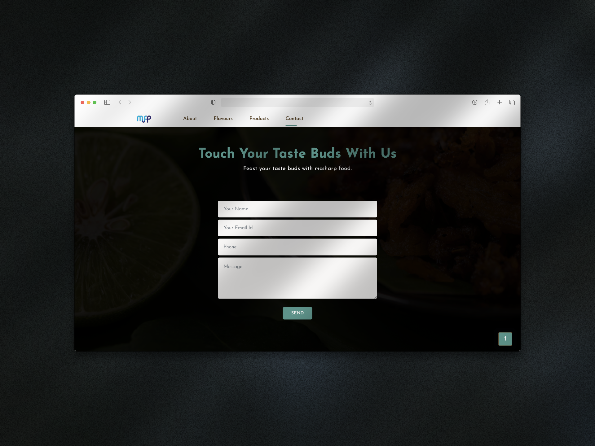
Provide simple, clear paths to enquiry or purchase.
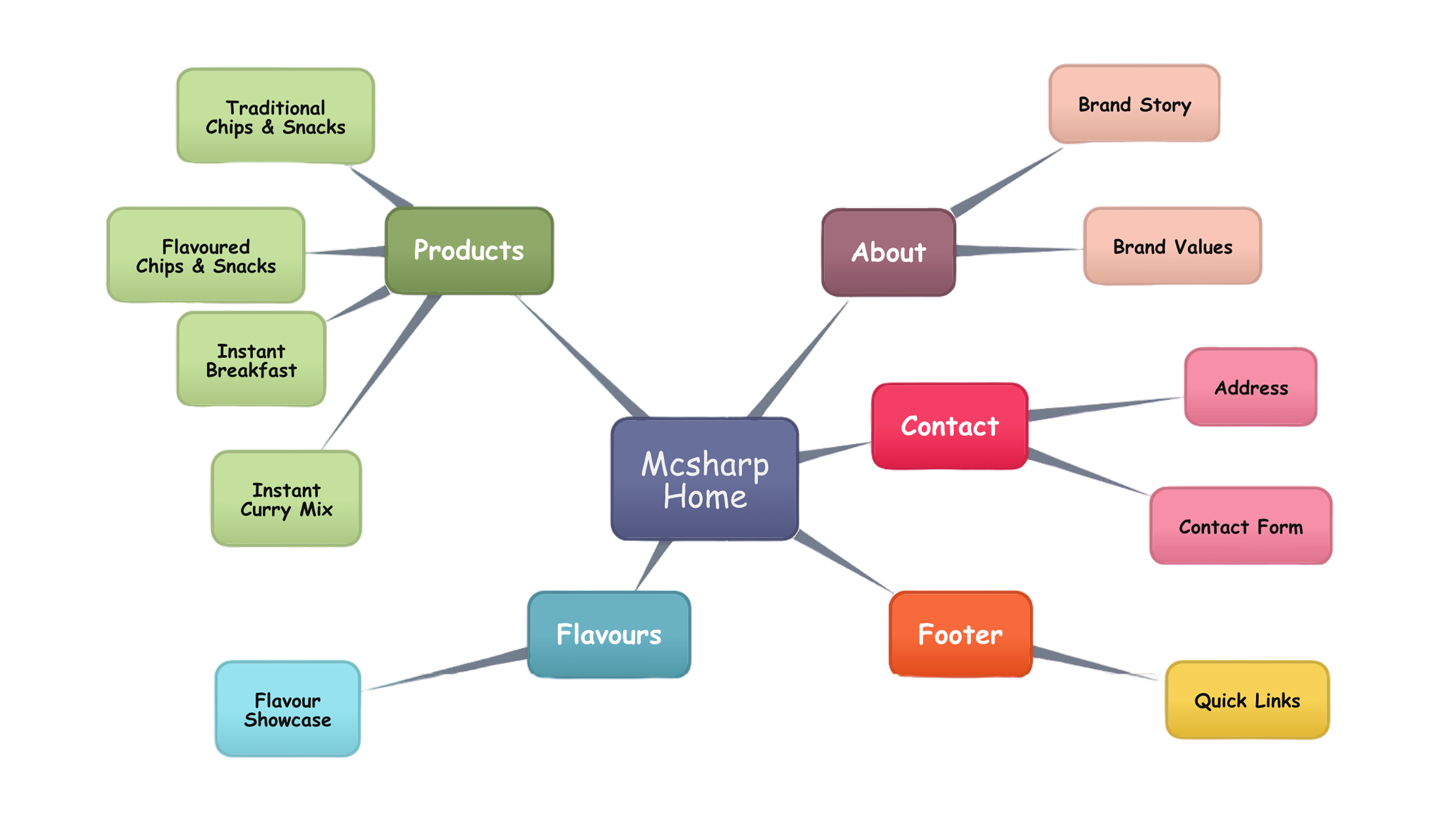
Architecturing the Flow
Low-Fidelity Wireframes
Starting The User Interface
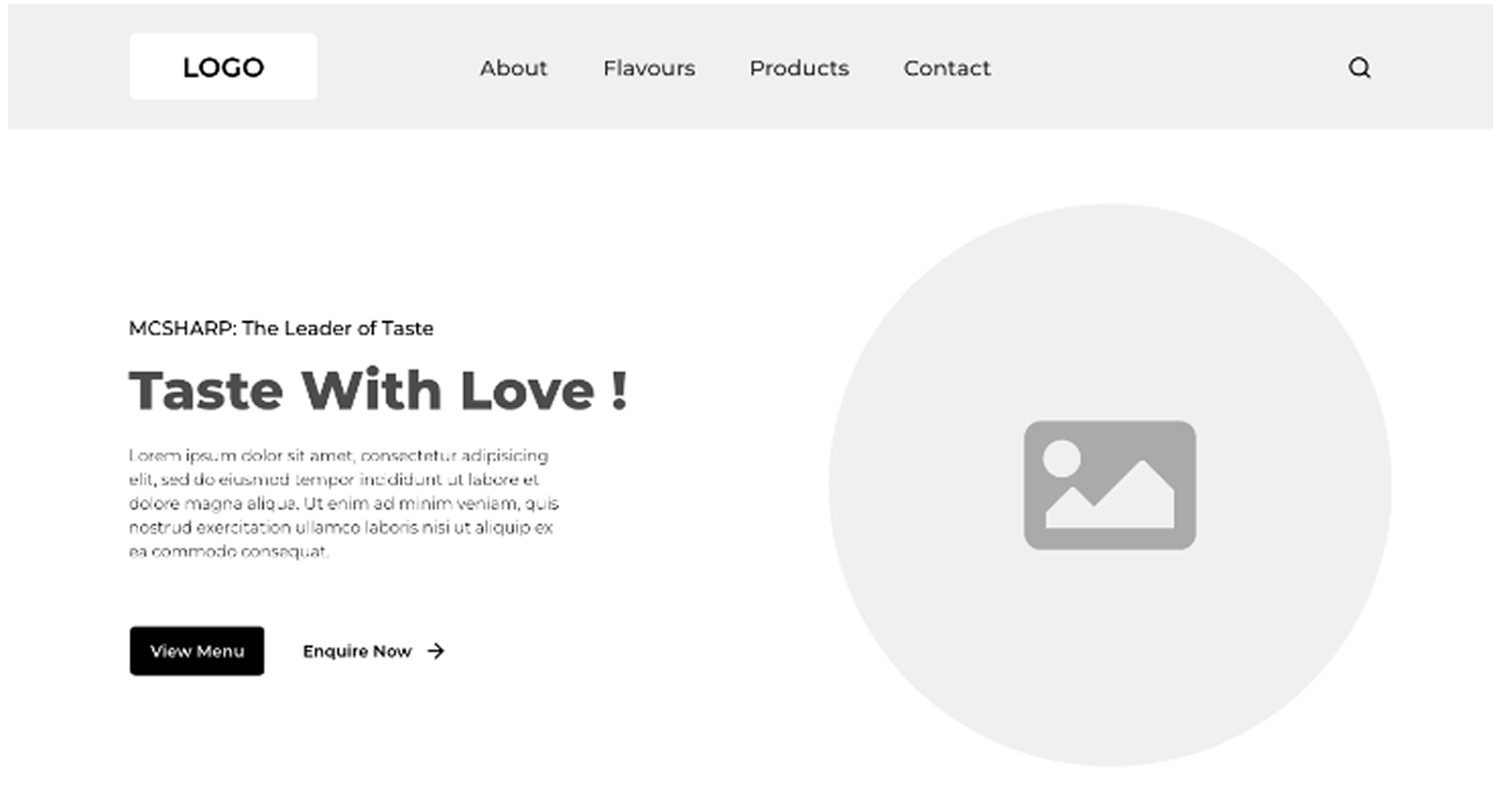
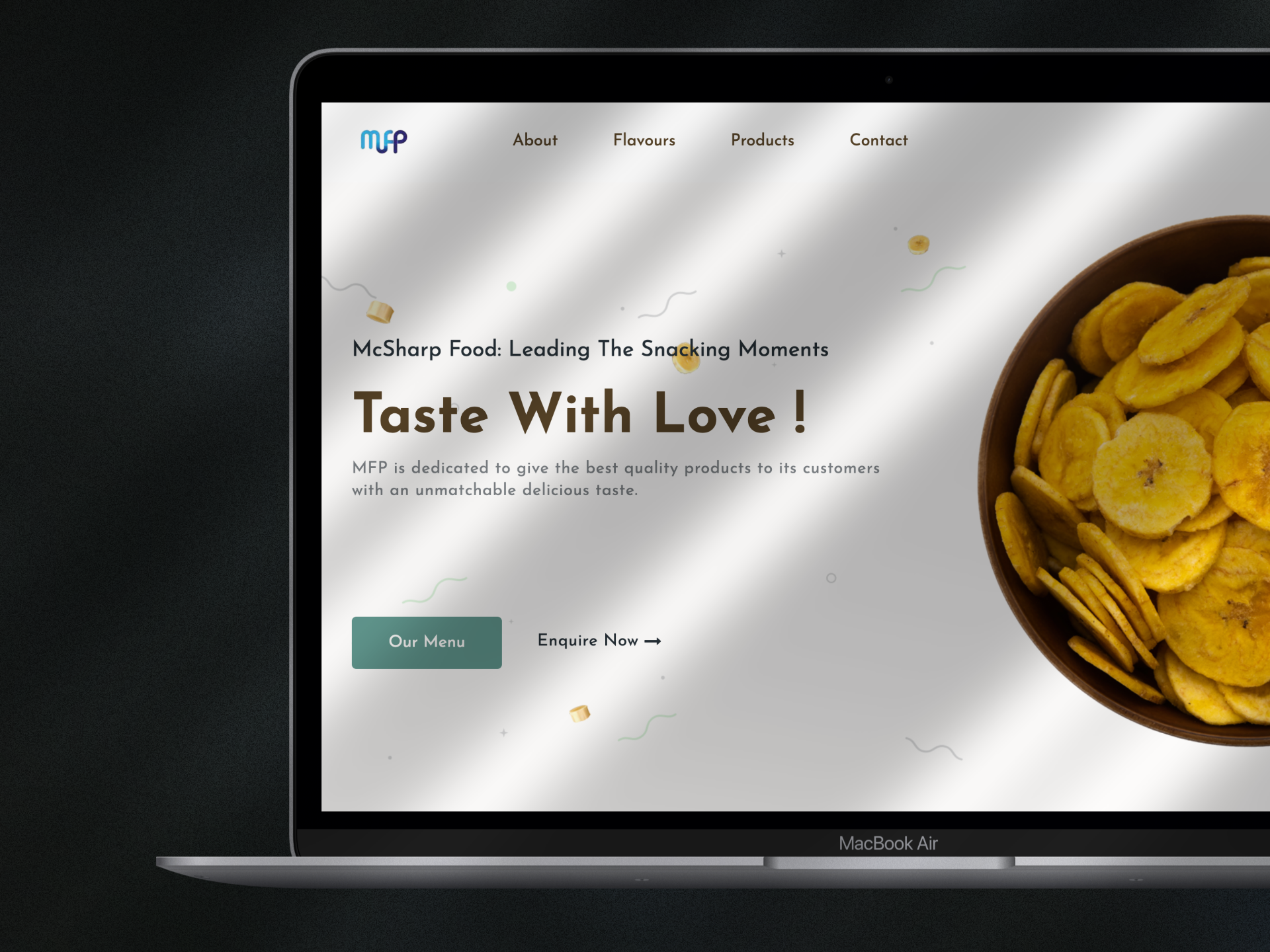
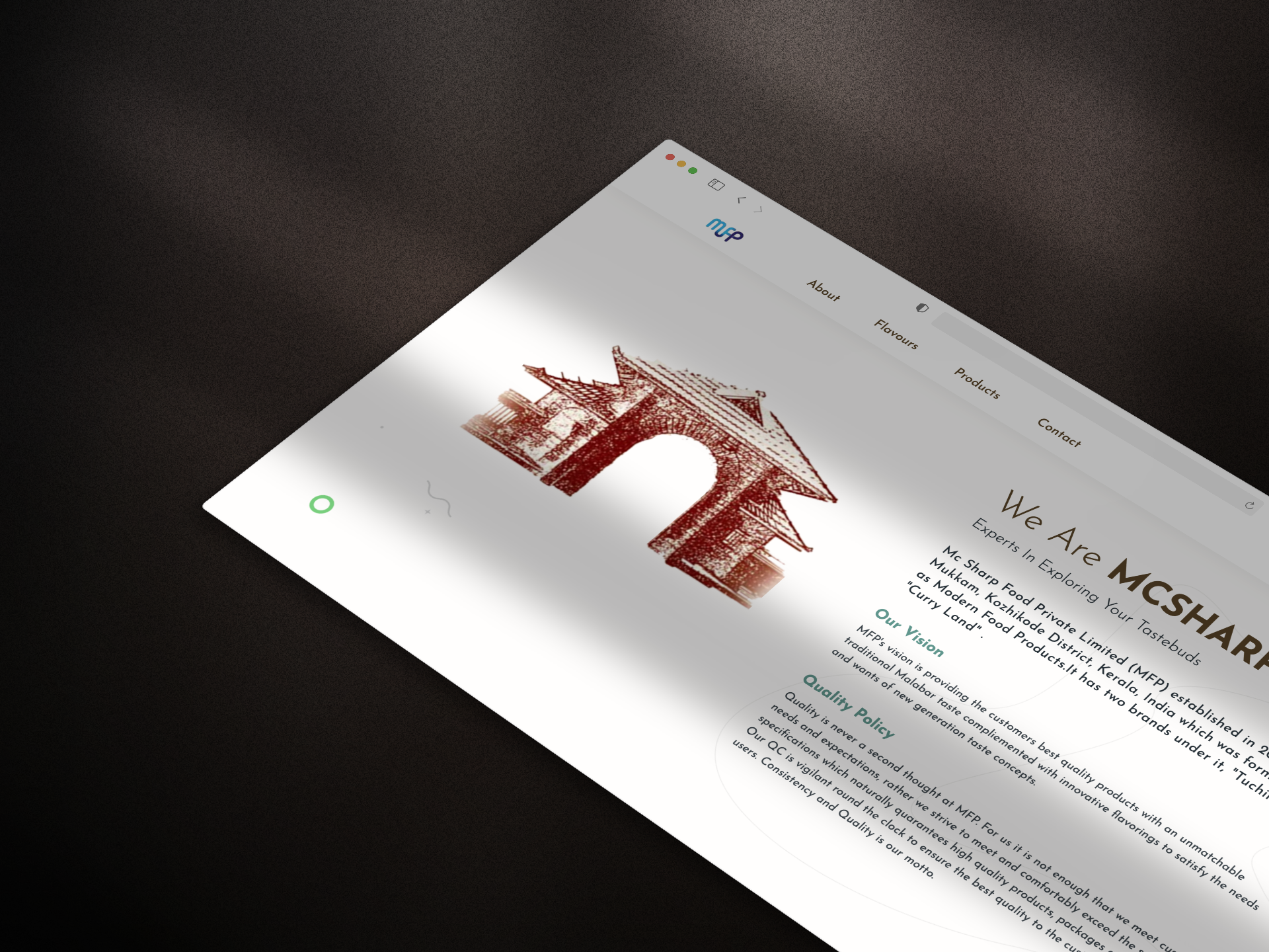
Designed a clear and intuitive navigation system, developed a visual-first layout featuring product photography, and incorporated brand identity consistently across the interface.
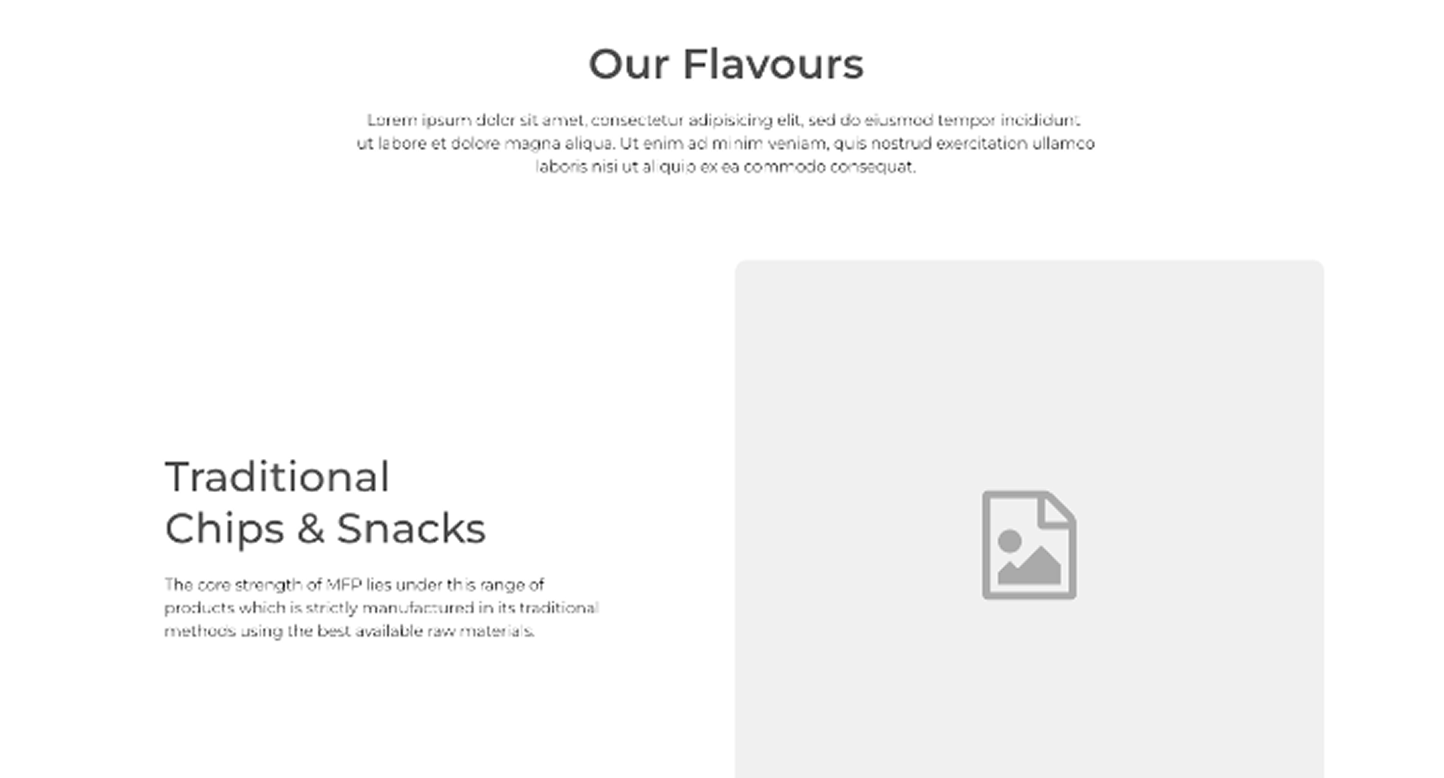
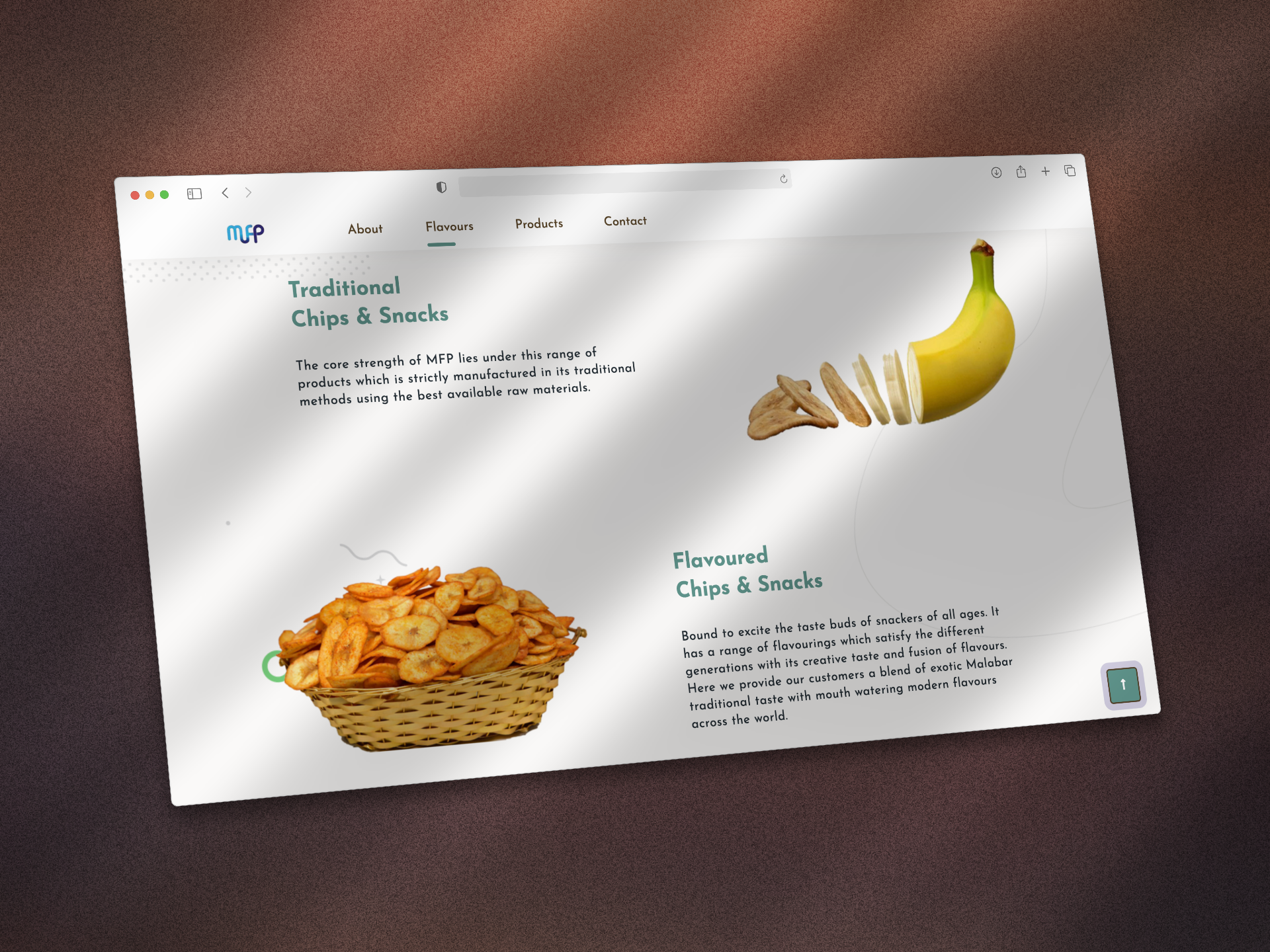
Designed to highlight the brand’s diverse range of flavours, addressing the stakeholder’s need to introduce their product varieties in a visually engaging and informative way that builds curiosity and trust among users.
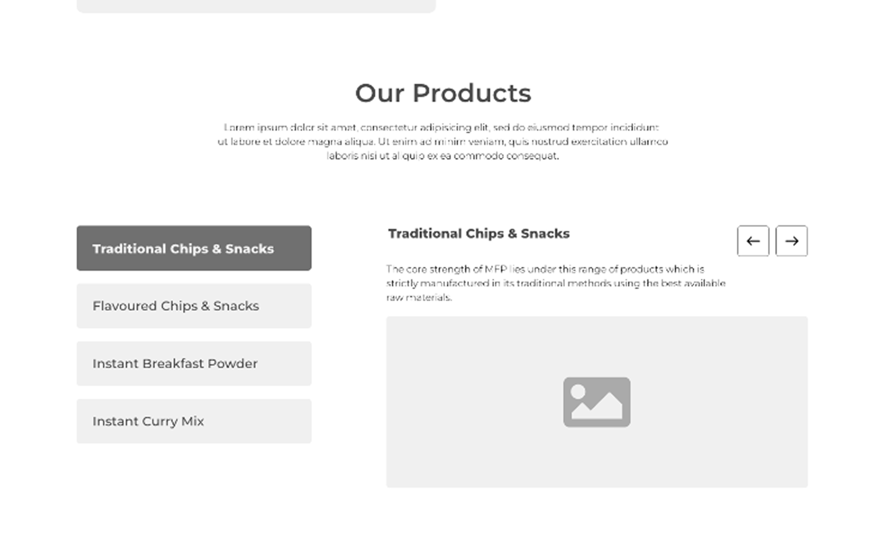
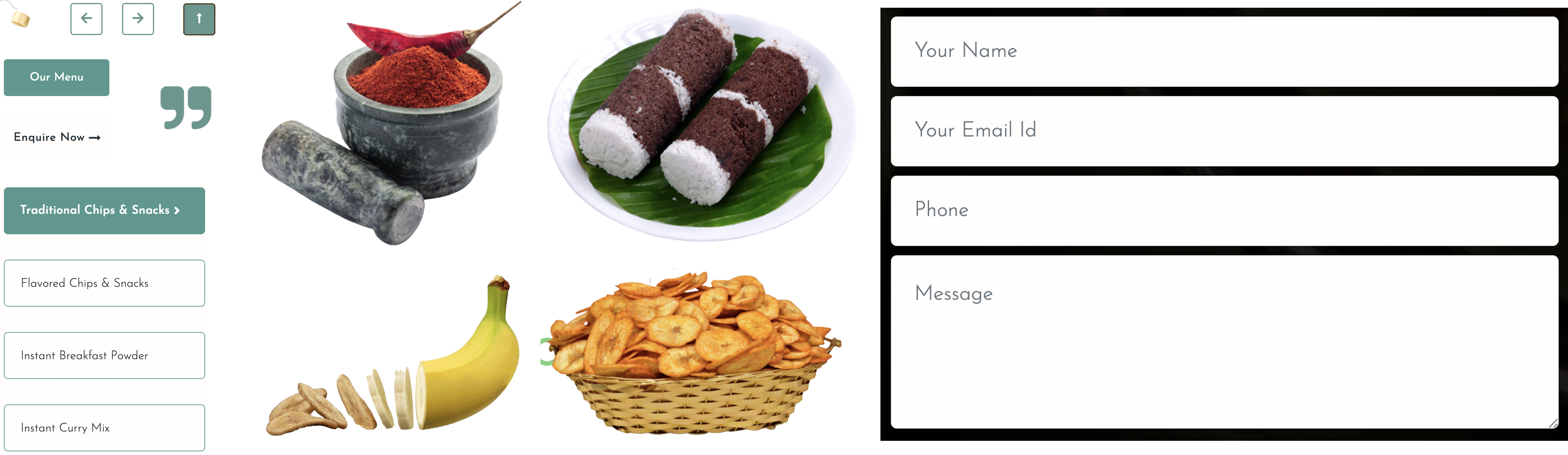
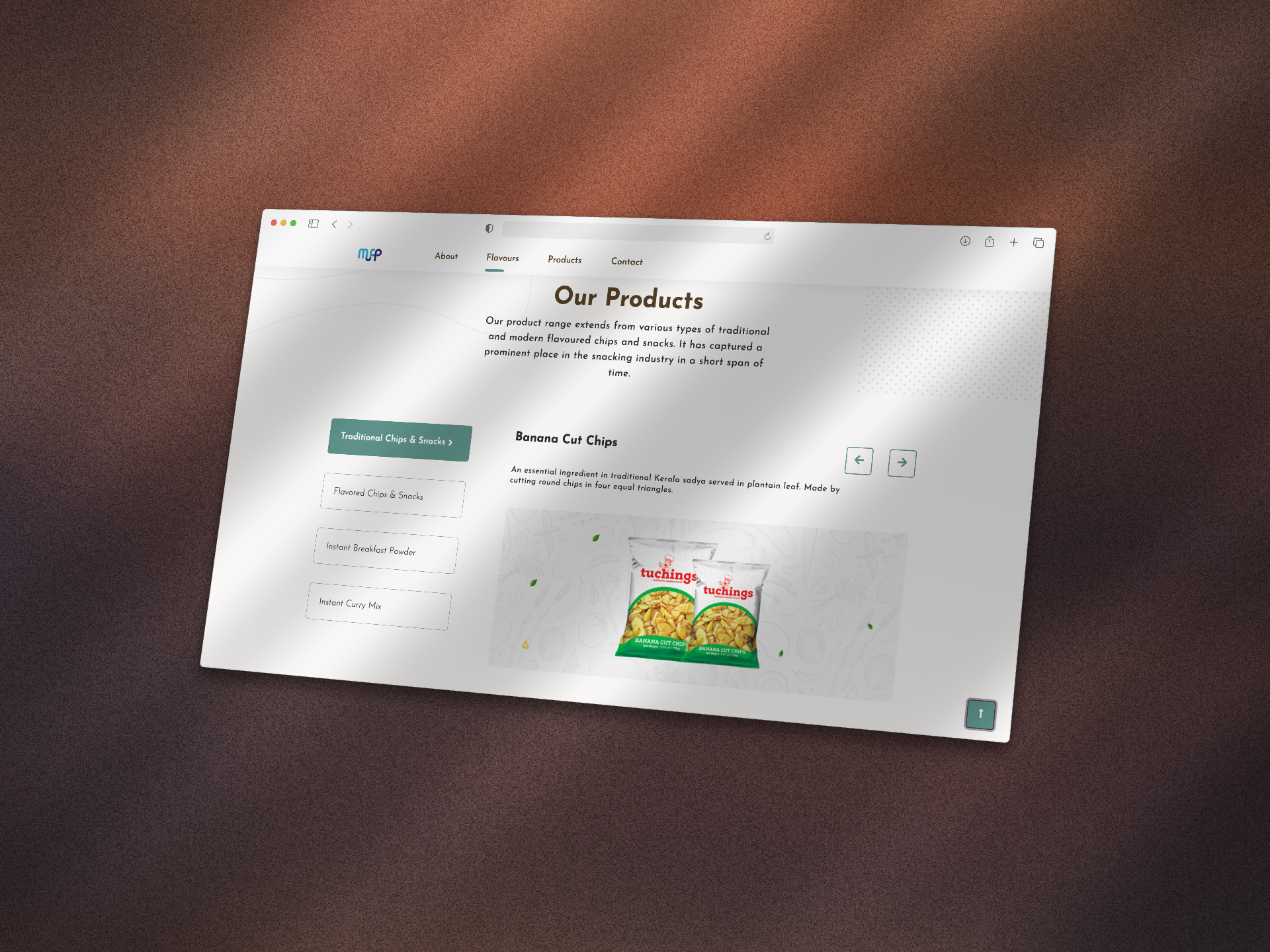
Grouped the products were organized into clear categories — Traditional Chips, Flavoured Snacks, and Instant Mixes — to make browsing simpler and more intuitive for users.
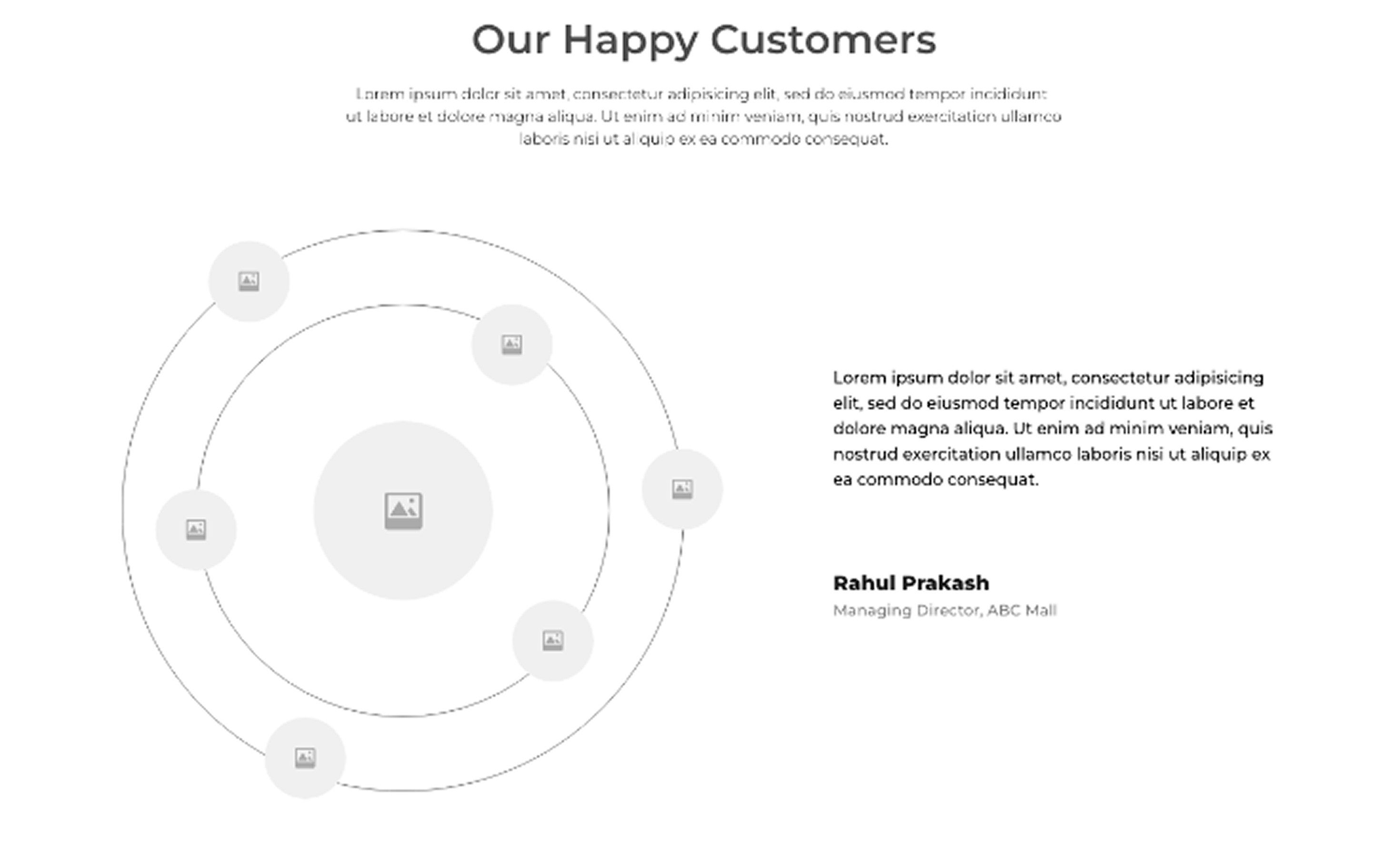
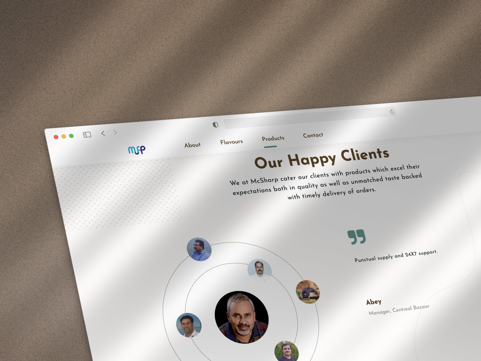
A dedicated customer testimonial section was added to showcase feedback from satisfied customers, reinforcing brand credibility and helping new visitors build trust in the quality and authenticity of the products.
Style Guide
Visual Design

Josefin Sans
Bold

Josefin Sans Semi-Bold

Josefin Sans Medium

Josefin Sans Light
High-Fidelity Wireframes
Start Filling The Colors
Final Outcomes
The final design successfully addressed the stakeholder’s objective of introducing their range of flavours in a clear and visually engaging manner. The “Our Flavours” section combines concise storytelling with product imagery, enabling users to explore different categories like Traditional Chips & Snacks through an intuitive and appealing layout. By maintaining a balance between visual hierarchy and brand identity, the section enhances both user engagement and brand credibility. The outcome not only improved content discoverability but also strengthened the brand’s online presence by presenting its products with authenticity and aesthetic consistency.