
- Technical and engineered feel, emphasizing precision and reliability.
Overview
T Blue, in collaboration with Toyo, is a brand known for its high-performance cleaning solutions, ranging from industrial vacuum cleaners to advanced pressure washers and accessories. With an established offline reputation, the brand sought to transition into a modern e-commerce presence that could showcase its products to a wider global audience.
The primary goal was to design a premium, conversion-focused platform that communicates strength, reliability, and global presence — while ensuring a frictionless buying experience for both B2C and B2B customers. The challenge was to blend industrial credibility with consumer-friendly design, balancing strong visuals, clear navigation, and intuitive product exploration.
This project redefined T Blue × Toyo’s digital identity, positioning the brand as a trusted, technology-forward player in the cleaning solutions industry.
The Challenge
T Blue’s sales were primarily offline, making it difficult to showcase their product innovation and global reach.
-
Present products clearly and attractively
-
Build trust through brand consistency
-
Enable a secure and seamless online purchase flow
-
Timeline
:
5 Weeks
-
Role :
UX UI Designer
-
Tools :
Figma, Photoshop, Notion, Vscode
The Goals
Build a user-centric interface that transforms product browsing into a seamless and confident purchasing journey. The goal is to create an experience where users can easily discover, compare, and evaluate products with clarity and trust. By simplifying navigation, highlighting key product details, and providing transparent feedback at every step, the interface not only enhances usability but also builds user confidence in their buying decisions. Every element from visual hierarchy to interaction flow is designed to reduce hesitation, increase engagement, and turn curiosity into conversion.
Defining Users

Richard
Facility Maintenance SupervisorAbout
Richard manages the maintenance operations for a large logistics and warehouse complex in Dubai. His daily responsibilities include ensuring the cleanliness and safety of industrial floors, machinery, and common areas. He oversees a small team and handles procurement for all cleaning tools, machines, and accessories. He’s tech-aware but doesn’t have time for unnecessary complexity. What matters most to him is efficiency — both in his team’s workflow and in the tools they use. Richard prefers dealing with brands that deliver reliability, detailed specifications, and responsive support.
Goals
- Quickly identify industrial-grade products that meet operational needs.
- Access clear specifications, certifications, and comparison charts before purchase.
- Build long-term vendor partnerships for consistent supply and maintenance.
- Ensure timely delivery and warranty coverage for large-scale orders.
Personality
Introvert
Extrovert
Analytical
Creative
Engaged
Relaxed
Disorganized
Organized
Self-centered
Team player
Brands Liked
Empathy Map

Does
Richard spends considerable time researching detailed product specifications and reviewing datasheets before making any purchase decisions. He cross-checks the reliability of each product by looking for certifications, performance standards, and genuine customer reviews. When interested in a product, he often reaches out to vendors for bulk pricing, maintenance, or installation details. To ensure alignment with his team and management, Richard frequently bookmarks or prints product pages, using them as reference points during internal discussions and procurement approvals.

Say
Richard often emphasizes the importance of transparency and detail when purchasing equipment. He’s the kind of buyer who says, “I need to know the specs before I can even consider a product,” and insists that warranty, service, and certification information be clearly visible. He frequently notes how frustrating it is when websites bury crucial technical data or make it hard to contact a representative. For him, every decision reflects on his credibility at work, so he often reminds others that “my decisions affect the whole maintenance team — I can’t afford a bad buy.”

Think
Internally, Richard is analytical and cautious. He constantly evaluates whether a supplier or platform can deliver on time, questioning, “Can I trust this brand for industrial-scale performance?” He expects a professional experience when shopping online and often wishes more suppliers designed their sites with B2B users in mind.

Feel
Emotionally, Richard’s experience oscillates between frustration and confidence. He feels frustrated when product details are hidden or incomplete, or when online stores lack professional presentation. He’s cautious about engaging with new or unfamiliar brands and anxious about delivery delays or post-purchase complications. On the positive side, he feels confident and reassured when a brand demonstrates reliability, provides clear technical data, and communicates proactively.
- Key Insights Richard values clarity, credibility, and convenience above all. He approaches digital purchasing as a strategic business decision, not a casual transaction expecting the same level of professionalism and trust online that he would receive from an in-person industrial supplier.

Susan
Interior DesignerAbout
Susan is a creative professional who works from home and often manages small interior projects for clients. She’s tidy, detail-oriented, and enjoys maintaining a clean, aesthetic workspace. Between her client visits and design sessions, she frequently shops online for practical, well-designed products that simplify her daily routine. Unlike industrial buyers, Susan isn’t looking for technical specs — she wants visual appeal, usability, and trust. Her decisions are influenced by the overall brand experience, customer reviews, and how intuitive the website feels.
Goals
- Quickly find products that fit her home and aesthetic using clear visuals and lifestyle imagery.
- Compare models easily to choose the best balance of design, functionality, and price.
- Verify trust signals (reviews, returns, warranty) so she feels confident buying online.
- Enjoy a fast, frictionless checkout with common payment options and transparent delivery timelines.
- Discover products that align with her values, such as sustainable materials or minimalist design.
Personality
Introvert
Extrovert
Analytical
Creative
Engaged
Relaxed
Disorganized
Organized
Self-centered
Team player
Brands Liked
Empathy Map
Does
Susan spends time browsing online stores, comparing products across multiple tabs, and reading customer feedback before making a purchase. She watches product videos or zooms in on images to check design details and finishes. Once she finds something she likes, she might add it to her cart but take a day or two to decide. She shares product links with friends or family to get opinions, and she’s likely to follow the brand on social media to check authenticity and see user-generated content.
Say
Susan often expresses the need for simplicity and reassurance when shopping online. She’s likely to say, “I just want something that works and looks good,” or “If I can see how others are using it, I’ll feel more confident buying.” She talks about how frustrating it is when websites feel cluttered or confusing, saying things like, “Too many clicks make me lose interest.” She values brands that are clear about pricing, delivery times, and customer service.
Think
Internally, Susan wants to make smart, informed choices without wasting time. She thinks about whether a product fits her lifestyle — “Will this fit in my space?” or “Is it easy to maintain?” She’s also cautious about trust, often wondering, “Is this website reliable?” or “What happens if I need to return it?” Susan appreciates when brands provide visual storytelling, clean layouts, and lifestyle imagery that helps her imagine the product in her own home environment.
Feel
Susan feels excited when she discovers a product that’s both functional and aesthetically appealing. She gets anxious about unclear delivery or return policies and frustrated when websites feel outdated or don’t load properly on mobile. When her shopping experience is smooth — from browsing to checkout — she feels satisfied and empowered, and she’s likely to recommend the brand to others. Her emotional connection to a brand deepens when she senses authenticity and good customer support.
- Key Insights Susan values simplicity, transparency, and visual trust. She seeks a seamless, aesthetic shopping experience where design, clarity, and reassurance guide her purchase decisions. For her, good UX isn’t just about ease of use — it’s about feeling confident and inspired while shopping online.
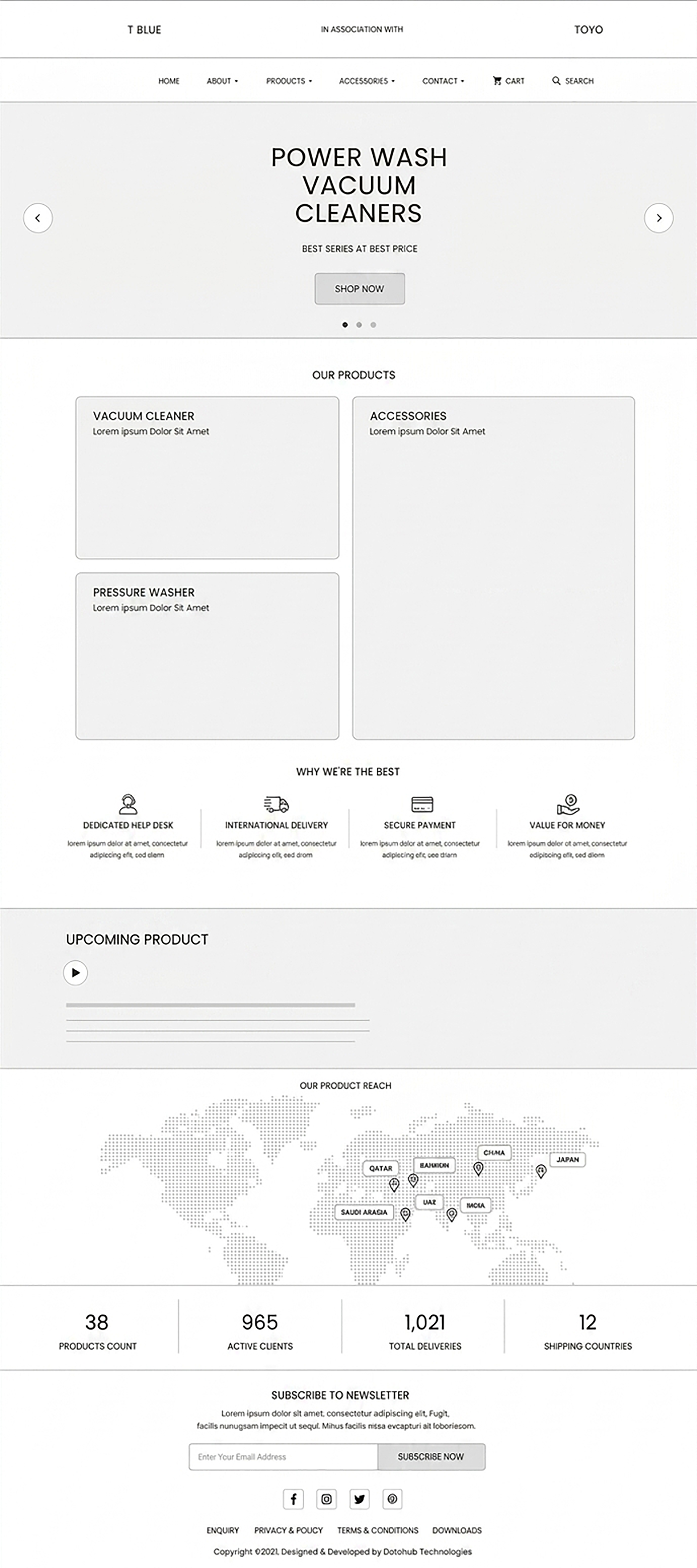
Low-Fidelity Wireframes
Starting The User Interface
Style Guide
Visual Design
Title
Aa
Poppins
Bold
Sub-Title
Bb
Poppins
Semi-Bold
Body
Aa
Poppins
Regular
Button
Aa
Poppins
Medium
High-Fidelity Wireframes
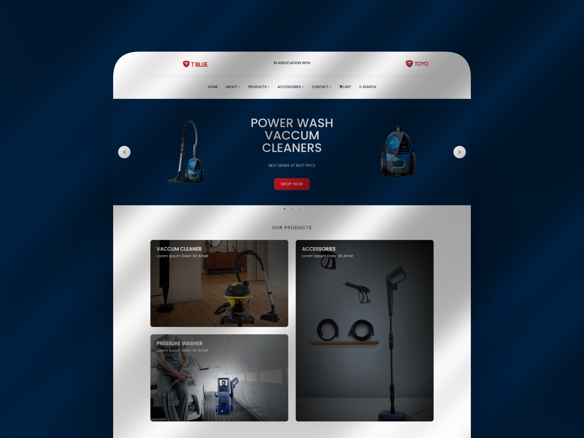
Start Filling The Colors
Final Outcomes
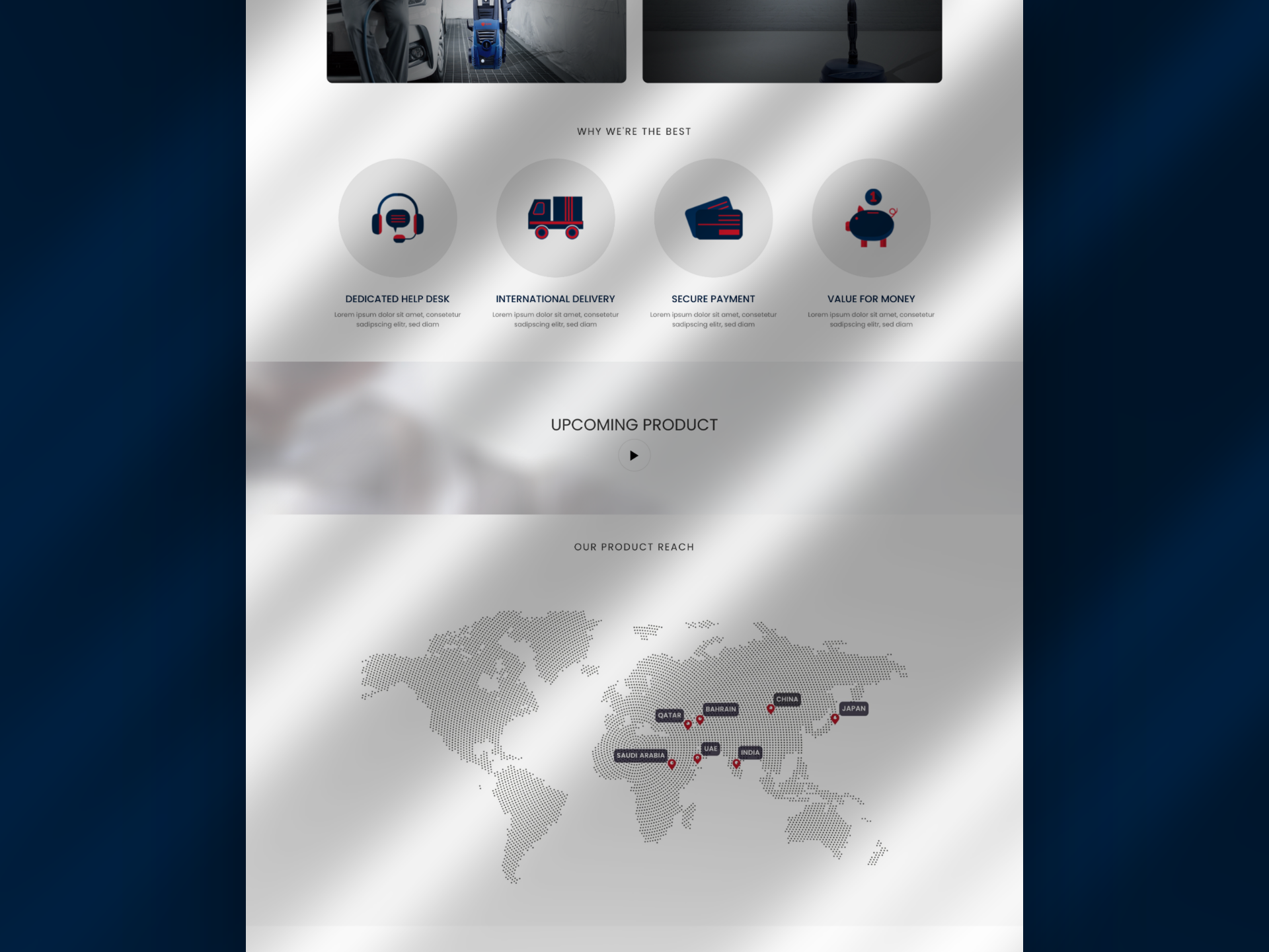
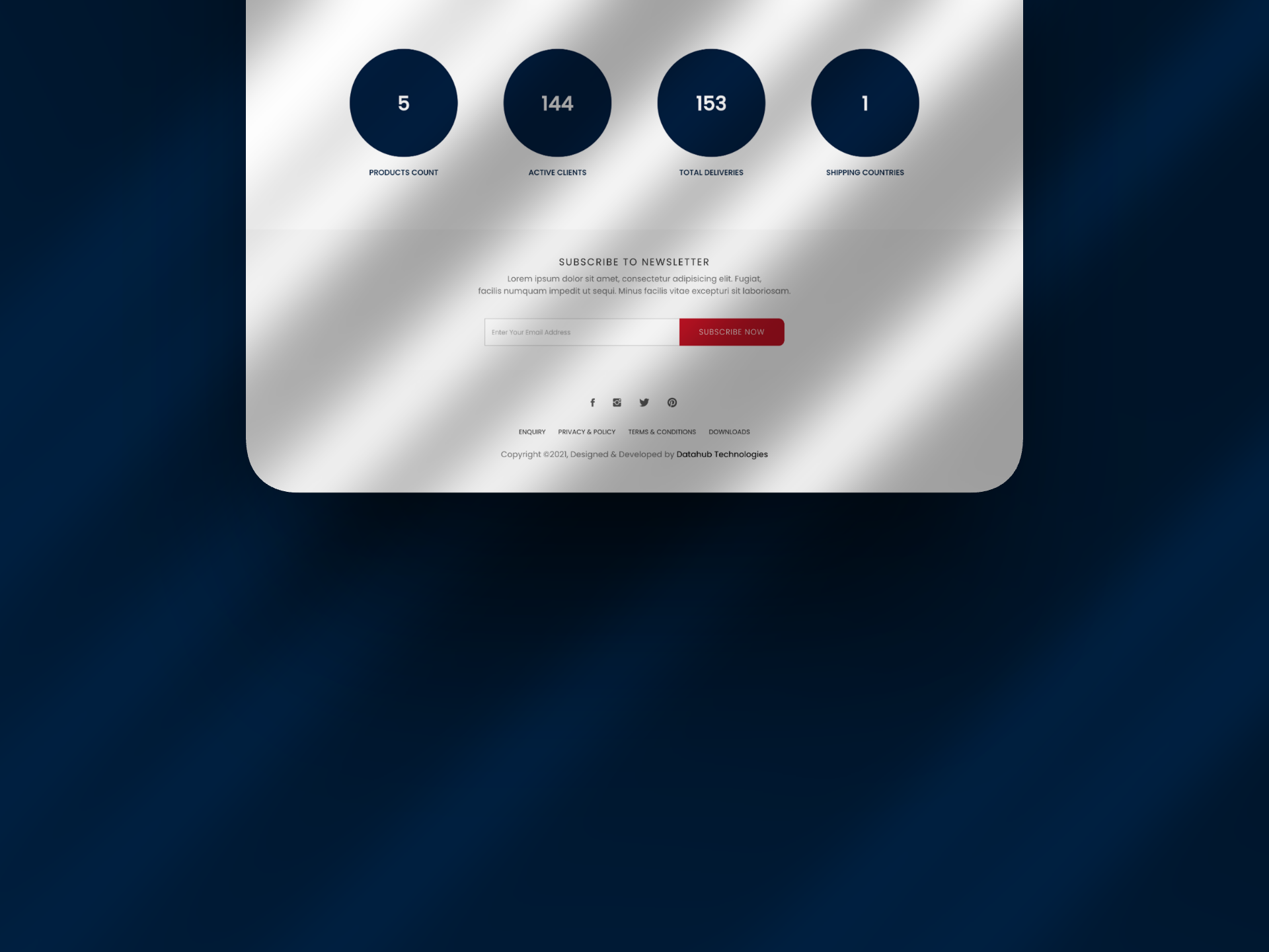
The T BLUE × TOYO website redesign focused on creating a clean, modern, and user-friendly e-commerce experience for home and professional cleaning equipment. Through a structured homepage, intuitive product navigation, organized product listings, consistent visual styling, and clear promotional elements, the design improves product discoverability and supports a smoother shopping journey. The unified color palette, typography, and UI components establish a consistent brand identity while balancing usability, product visibility, and brand credibility.